Here includes the post-production and/or editing process of our music video. This blog is entirely written by Timo.
To begin, I opted for Adobe Premiere Pro CC 2020, a timeline-based and non-linear video editing software application, as my primary tool for video editing due to its comprehensive features and interface I was already familiar with as I have used it for over 3 years. After each day of filming, I established a habit of managing my files by transferring the necessary clips and images from the SD card to my desktop, ensuring a streamlined editing workflow. Once imported into Premiere Pro, I filtered the shots, eliminating any footage deemed irrelevant. The software's intuitive design facilitated the synchronization of clips, with the marking feature being very useful. This feature allowed me to label specific points in the timeline, enhancing precision and efficiency in the editing process.
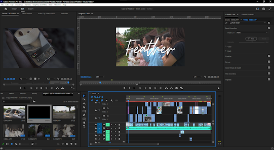
Shown below is the overall timeline of the project:
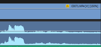
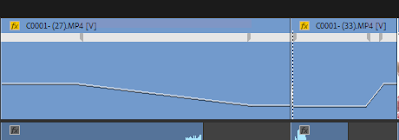
As seen in the image above, the use of markers proved to be very useful. Since I am editing a music video for the first time, the process of doing so requires a new step that was previously foreign to me. Before importing any clip into the timeline for an edit, I needed to sync the scene to the music. This is because a slight delay would be very obvious, especially in scenes where there is a close-up of an actor lipsyncing to the camera, a slight delay of a few seconds would make the product look ugly and unprofessional, which is why I had to be very detailed when syncing clip audios to the song. However, during our filming process, we had a clapboard which made it easier to sync clips, because the audio in the timeline would have a spike because of the loud sounds, giving me a guide on where to cut the clip. An example of this is shown in the image below:
SIGNIFICANT EDITING CHOICES AND METHODS
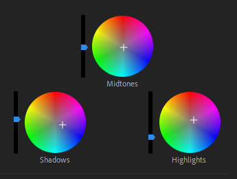
Colour Grading (Lumetri Color)
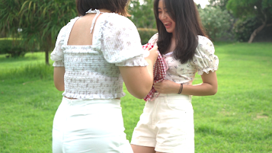
before colour grade
after colour grade
color wheels in premiere pro
Knowing that we have a theme and color scheme to follow, I saw that the raw clips were far from the right color to portray what we wanted, with this, I spent hours colour grading the clips to find the perfect balance between warmth, saturation, and exposure we wanted. I believe that the colour grade I created portrays the perfect amount of warmth that is felt when friends get together, just like the scene depicts.
Speed Ramping (Time Remapping)
example of a clip that uses speed ramping (2:43-2:47)
speed ramping keyframes
Speed ramping is a technique of smoothly transitioning between different playback speeds within a single clip or sequence. This allows for dynamic changes in speed, creating visual interest and emphasizing specific moments in a video. This method of editing was done in three steps; in the timeline, position the playhead where you want the speed change to begin. Set a keyframe for the Speed/Duration option in the Effects Control Panel. Move the playhead to where you want the speed change to end and set another keyframe. Then, change the speed value between the keyframes to the desired speed. You can then adjust the bezier handles on the keyframes to control the easing in and out for a more gradual speed change. Overall, the use of speed ramping was very useful in creating emphasis, and adding drama to a simple action. In the clip above, the girls are seen to be opening a picnic blanket, with speed ramping, a simple action can become very visually pleasing.
Jump Cuts
scene that uses jumpcuts (1:12-1:18)
jumpcuts in timeline
In this music video, jump cuts are utilized to adjust their actions to the pacing of the music. By identifying static points in the footage where minimal changes in framing or camera position occur. I used the razor tool to cut the clips at these jump-cut points and arrange the remaining sections consecutively on the timeline.
Self Reflection: As Timo did a great job in explaining the edits he utilized and editing the music video itself, I (Sharon) have learned that these features used in the editing software assisted in enhancing the quality of the clips and made editing more time-efficient, which was nice due to that we completed the shoots near the submission date. Such that the markers allowed Timo to edit the clips much quicker. In addition, I acknowledged that these features enabled him to experiment with different editing styles, quality, and colours (through colour grading) (which I believe was difficult, but due to technological advancement, it became easier, and more effective in the long term) to see which one of those would suit the overall theme of blue, lively, and a calm feeling to the fans/audience.
Here includes all my personal research and development on social media pages. This blog is written by me (Sharon).
Research
With Ariana Grande's social media page regarding her latest release "yes, and?", I've seen that she posted pictures and videos (related to the release) within the timeline of the days leading up to the release until post-release days. Ariana published a post of her being in the production room which helps excite her fans about her upcoming release - this is achieved by word of mouth that spreads the information (greater promotion) to a larger audience/fan base. She has also posted a video teaser on her music video simply a day before the showcase/premiere which could be with the suggestion of reminding her fans that it will be out tomorrow. Several parts from the music videos were then posted on the day of the release with the caption that included giving credits to the director, choreographer, assistant, dancers, and those in charge of hair, makeup, and outfit. Posts after the day of her release contained behind-the-scenes pictures, a thank-you message to her fans, and the song's debut on Billboard. These could intrigue her fans on what behind-the-scenes look like for Ariana.
I like how Ariana presents her overall aesthetic throughout the release of her album which also coordinates with her personal aesthetic when uploading daily pictures.
The footballer's Instagram page has a wide variety of posts: family, award ceremonies, promotions, achievements and celebrations that I prefer best for our star's page. Ronaldo's social media page has no certain aesthetic, which isn't the most ideal for our star's page as we're leaning towards a blue, soft aesthetic.
What I like about these 2 (Ariana Grande and Cristiano Ronaldo) celebrities' accounts is their openness towards their daily lives, such as posting pictures of their friends and family, and pictures of them in their personal times (outside working hours e.g. filming, football matches, stage performances). These suggest Richard Dyer's stardom theory of ordinariness - suggesting that as fans, we like to see their daily routine, and living their normal lives.
Moreover, I had to look into the actual artist's, Sabrina Carpenter's, social media page as well. She gave a variety of uploads, such as teaser pictures of her in the recording room (14th most recent post) to hint to her fans that there will be a new song release, featuring a daily life picture (15th most recent post), a behind the scenes picture and video (12th and 9th most recent posts) with a caption to thank her crew and fans, and a 30 seconds clip (11th most recent post) by the time of the release to further inform her fans to stream. Nonetheless, Sabrina also uploaded photoshoots of her in a magazine (3rd most recent post) to fill up her feed and a promotion post (2nd most recent post) on her fragrance line! She had also started posting photographs from each of her tour locations (3rd to 6th most recent posts) to further thank her fans for welcoming her to their country.
I like how Sabrina promotes herself really well on her social media account, starting from the vast amount of behind-the-scenes, teasers, and clips of her upcoming music video to continue informing her fans regarding the release. As well as her promotion towards her fragrance line with an interesting cover picture inevitably enables the audience to keep on swiping on the post, reaching a final picture of the perfume. She truly seemed grateful to her fans which delivers great manners.
Development
Nayana started off by sketching out the desired layout for KIARA's social media page after discussing it with me (Sharon), Maxi, and Timo. It is seen as follows:
As a group, we wanted to go for the "ordinariness" approach to intrigue fans about the star's daily life and posts that can deliver her persona, such as through the '10 Qs with Kiara' video. We also chose to upload teasers and behind-the-scenes pictures pre-release and post-release to further promote and inform fans about the music video - to reach more audience and to remind fans to continue to stream.
'10 Qs with Kiara'
This content was heavily inspired by Vogue's infamous '73 Questions' series with numerous celebrities/artists. We believe that it is a great way for fans to learn more about KIARA herself and to further illustrate the star's 'ordinariness' as the questions surround her likes, hobbies, and interests, just as how normal human beings are. One of the examples of Vogue's series featured a teenage pop artist, Olivia Rodrigo as follows:
Hence, we came up with questions that also revolve around how we can showcase the star's personality, and also to simply promote her upcoming release. Below are the 10 questions Nayana made for KIARA which we will record on one of the days of shooting:
From 1-10, how excited are you for your newest album?
What is your favourite drink to get?
What is your New Year's resolution and have you stuck to it?
What is your favourite trend from social media?
What is the one thing you must have when you go travelling?
What is your comfort food?
Show us your favourite spot in the set!
What is the most precious gift you have received?
What is your favourite activity to do in your free time?
Lastly, deliver a short message for those who are watching right now!
After Nayana sent these questions to our group's group chat, Maxi revised the questions:
From 1-10, rate how excited you are for your upcoming album release!
What is one drink you can't find yourself living without?
What is your New Year's resolution and have you stuck to it so far?
What is your current favourite social media trend?
What is one must-have item for you when you go travelling?
What is your comfort food?
Out of all the spots in this set, which one's your favourite?
What is the most precious gift you have ever received?
What is an activity you love to do during your free time?
Lastly, give us a short message for all the fans who are watching right now!
Maxi then wrote desired responses as our star had no clue how to answer:
gotta be a 10! i’ve put in so much work into this and i hope y’all are all as excited as i am!
matchaaa!! (she can hold the drink while were at it)
well, i’ve been trying to get to school on time more often and uhm, thats going about as good as u’d think it is 😁
uhmm, (whispers) dont tell anyone but… the dont go insane trend by dpr ian…
can’t leave this island without my film camera!!
hmm… tough question! i think nothing could beat bakmie after a long day of school though!
oh c’mon, it’s gotta be this absolutely beautiful view, just look at it! (points towards view from house ledge)
actually, i’m wearing it right noww, this necklace was given to me by my dad, back when he was still with us, and i’ve never taken it off ever since
hmm, good question, i think either dancing, or watching musicals have to be one of my favorite things ever though!
thank you guys sosososo much for watchingg, and dont forget to save March 3rd onto your calenders! see you guys soon! love youu! (blows kiss)
However, we did not end up sticking to the responses as we believe it doesn't seem natural of her and it might be time-consuming for our star to memorize these responses. So, our star went on with answering these questions naturally and according to her liking, interests, and hobbies as well!
On the day of filming '10 Qs with Kiara', Nayana was the one who recorded, while I (Sharon) asked these questions in the background.
Here is the uploaded video on '10 Qs with Kiara' on the star's social media page:
To further promote the star's album release and improve audience/fan engagement, we came up with a dance challenge using the title song, 'Feather'. The following dance was inspired by the existing TikTok challenge with the song 'Feather' as well. We then recorded the dance challenge on our final day of shooting (day 4) at the park.
Behind-the-scenes of Timo recording our star (in the middle) along with her 2 friends by her side doing the dance challenge.
Here is the uploaded dance challenge on the star's social media page:
Nayana used Audacity to edit the background sound/music for the teaser video of the star's upcoming music video release. She incorporated the original song, 'Feather', instrumental and acapella versions as well as the sounds of the ocean's waves. Below is a screenshot taken by Nayana of her editing process:
Below is the final sound/music we used:
Here is the teaser uploaded on the star's social media page:
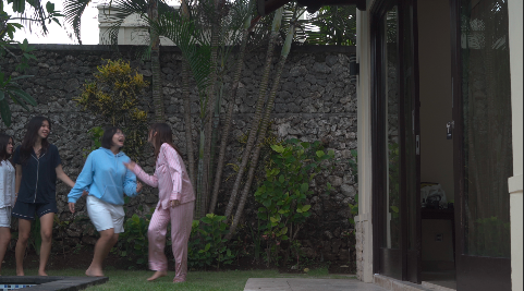
As we want to aim for mainly "ordinariness" within the star's promotional posts, we took photographs of her at the beach (day 1 of shooting) and at the park (day 4 of shooting). We also asked the star to send us some of her selfies or any other pictures she or her friends took of her that might fit into the social media feed aesthetic that we are going for - vibrant, soft colours, and bright. These pictures will give fans an insight into what the star does in her free time, who she hangs out with, and more or less her "real" persona.
These pictures were taken by Timo.
Here are the personal pictures uploaded on the star's social media page:
Self Reflection: Doing the research first thing before planning and developing the star's social media page really helped me get a deeper insight into what an artist's social media page typically looks like before and after releasing an album, song, or music video. As Timo took most of these pictures, I chose which one of those would look best on the star's social media page and which could showcase KIARA's personality best, whereas Nayana did the layout and editing. I tried to take part as much as possible, such as asking the star the questions for '10 Qs with Kiara'. Although I was scared that it would take many takes as I might speak too quickly, so I stayed calm throughout and was able to complete that in 2 takes. One thing I found challenging was unable to expand my creativity in some of the posts, such that for parts that I wasn't able to do anything, I would still be as active in giving feedback, insights, and edits, such as the social media posts Nayana made primarily in Canva. Overall, we did a great job in combining our creativity in assembling these social media posts and this could help us present KIARA's personality of talented, soft-spoken, talented, and lively.
Here includes all my research and development of the digipak. This blog post is written by me (Sharon).
Research
Digipak Cover
I have done individual research on the digipak cover on female pop artists since our star herself is covering a pop song, 'Feather' by Sabrina Carpenter. The following shows my research on digipak covers that I find interesting and that I believe match the overall vibe of our bright and calming theme.
I admire these portrait shots of the artists that feature a medium close-up shot. I believe that these shots are significantly attractive to the audience's eyes. I like how Taylor Swift's 'Fearless' cover (2nd picture from the first row) and IU's 'LILAC' cover (3rd picture from the last row) depict a sense of freedom, which is the message we are going for.
Below are the pictures Nayana found on Pinterest that she believed would match our concept best. We considered that these pictures would illustrate the star's personality of being soft-spoken, calm, and free. A simple, elegant shot is what we are going for, such as wind-blown hair, hands in the air to display a sense of 'freedom', and either looking directly into the camera or looking away with simple, nature-like colour tones.
The pictures below are compiled by me (Sharon).
The pictures above of Korean artists and singers include a feature that I believe would be a great addition to our digipak, that being along the lines of "The 1st Mini Album" text. This could allow the audience to check our star out and her skills as Kiara establishes an identity in the music industry. I suppose the text may deliver the message of that our star is ambitious in growing her career as the text "The 1st" suggest that she will be releasing more albums in the future.
CD Cover
Below, I (Sharon) have compiled all the CD covers that I think to suit the theme of our music promotion package best. All these CD covers show a calming feeling to them, such as through the white birds spreading their wings to suggest 'freedom' and purity of new beginnings, which is the message we aim to deliver upon the star's break-up with her ex-lover. I would like to experiment with photographing the feathers instead of the white birds, although I believe it would be too difficult to have them stay up in the air. I like all their simplicity without doing too much over the top. As for Lana Del Rey's CD cover (the last picture), I would try using a picture of the sea or the sky.
Back Cover
My research on the digipak's back cover includes artists and bands from the 1960s. Despite the fact that the following example was albums from years ago, we would like to add elements of retro albums, and I like the idea of having an anecdote on the back cover, especially for new artists and singers releasing their first album, which is the same as Kiara (our star). This could provide the audience with a general overview of the artist, such as any past achievements in the star's career.
Development
Layout Planning
Nayana has planned the 4-page layout for the digipak:
Cover
Tracklist
CD
Small anecdote on the back cover
Hand signature
Social media information
QR Code
Barcode
Below is the sketch/draft Nayana created for the layout
Anecdote
Nayana requested Maxi for a small anecdote regarding the star, KIARA. Below is what he wrote:
"After rising into the limelight of public attention at the age of just 13, 17-year-old Indonesian singer-songwriter KIARA continues to push the boundaries of what the music industry considers feasible. Feather - her newest album - debuted at number 1 on the Billboard Hot 100 in 32 different countries. Hailed by both the public and the industry alike as one of the most creative and inspirational talents of her generation, the end of KIARA's rise to stardom is seemingly nowhere in sight."
Tracklist
Below is the tracklist Nayana made, in which she combined the actual artist's, Sabrina Carpenter's, songs as well!
Feather
Just Say Yes
Nonsense
Actin'
Boy(friend)
Nowhere Near
Idyllic
Digipak Cover
Here, I (Sharon) have compiled all the mock-ups we (Sharon, Nayana, and Timo) made in Canva. We trialled with a variety of fonts, designs, and placement, all with the same picture. After many revisions and feedback, we have decided on the first picture (circled in green) as our digipak font. It seems elegant and lightweight through the cursive font, as we wanted, which I believe could provide a radiant and eye-catching effect to the audience.
However, as we had more photoshoots in all the filming locations, we did more mock-ups with these photos. We experimented on the placement, ratio, and pictures.
On the first three (3) rows of mock-ups, we kept the pictures and the placement of the title in the same exact position, where we only trialled on the writing at the top of the cover, some stating "The 1st Mini Album" and some simply stating her name "KIARA". We also experimented with different colours, such as light blue, navy, and green. This is due to we wanted the writing to stand out, where navy shows a darker shade of blue from the ocean in the background, but we also experimented with green that matches with our inside cover of the digipak - illustrating the green park. All the fonts that we chose were still following our theme, keeping it soft, elegant, and simple. We experimented with solely writing "KIARA" on the top of the page to prevent overwhelming the audience with too much writing and/or information since we aim for simplicity and elegance.
Feedback: Our media teacher did not like how "The 1st Mini Album" and the writings underneath looked - they make it seem so full. He also mentioned how the "1st" was misread as "Ist", which we have modified through the fonts. So he suggested solely writing "KIARA" on the top to keep it simple.
On the fourth (4th) row, we experimented with the positioning of the title and the sizes of the star's figure to illustrate the best proportions. The first and third mock-ups seemed too crowded since the title and the writing of "The 1st Mini Album" were too close to one another, which I believe is less eye-catching due to the lack of organization.
Conclusion:
Above is what we finalized. Although our media teacher suggested changing the typeface for the writings at the top, we, as a group believe that it suits the overall illustration best. We also decided to use the green to show the relation to the following pages (inside-left and inside-right - the CD cover) which we will be using the pictures at the park (green). The pose, as well, depicts the feeling of 'freedom' best through the hand gesture and the low-angle shot overlooking the bright blue sky paired with a lightweight, cursive typeface for the title in pure white.
Tracklist
We have experimented with different designs for the tracklist page with the pictures we have taken at the beach and the park. Our first attempt was the first picture without the solid light blue background, however, we believe that it would be too difficult for the audience to read the information. So, we tried adding the solid background partly along with trying out different pictures which eased us in reading the tracklist. Due to the lack of pictures by that time, I experimented with simply using the photograph of the sea and the sky, but yet again, it was difficult to read out the information and it didn't seem to match our 'calming' aesthetic. As we photographed her at the park, I acknowledged that her wind-blown hair side profile overlooking the tracklist seemed perfect. The green background of the park contrasting with the star's brown hair appears more fresh than the pictures by the sea. So, I put that into a design which we finalized on using, that being the second (2nd) picture on the third (3rd) column.
Feedback: Our media teacher suggested either removing or changing the typeface for the "Tracklist" writing as the 'L' seemed too over the top.
Conclusion:
Above is what we, as a group, finalized. We changed the typeface for the "Tracklist" to a simpler one that I believe reciprocates with the star's windblown hair to further depict the pacifying effect of freedom.
CD Cover
Here, I have compiled all the mock-ups for the CD cover that I (Sharon) experimented on. With the pictures of the sea we took at the beach, I did not like the colour tone and it did not give much detail of the clouds and the vibrance of the colours.
Conclusion:
Above is what we, as a group, finalized. With this photograph we took at the park of the bubbles floating around, I believe that it gave much deeper meaning to our 'freedom' theme that presents vibrant colours and in order to follow the colour scheme from the tracklist page (also from the park). What I like about the bubbles is that they show simplicity while suggesting much more meaning to freedom according to the star's life. I purposely did not position the bubbles in the middle of the page so that it seemed natural.
Back Cover
We experimented on the back cover by first adding a barcode, then adding the star's stage name "KIARA", and lastly, to give the audience a gist of who the artist is, Maxi wrote an anecdote, which he did by looking at the "about" section for multiple artists on Spotify. The following paragraph is as follows:
"After rising into the limelight of public attention at the age of just 13, 17-year-old Indonesian singer-songwriter KIARA continues to push the boundaries of what the music industry considers feasible. Feather - her newest album - debuted at number 1 on the Billboard Hot 100 in 32 different countries. Hailed by both the public and the industry alike as one of the most creative and inspirational talents of her generation, the end of KIARA's rise to stardom is seemingly nowhere in sight."
Conclusion:
Above is what we, as a group, finalized. The anecdote, I believe, would give audiences and fans a better insight into who KIARA is. A medium shot of the star gives a significant ending to the digipak on the back cover, overlooking the ocean.
Self Reflection: Starting off this digipak research and development, I felt lost and did not know where to start. But, as the research went on and with the help of my teammates giving feedback and insight back and forth, I was able to continue to improve these designs. The use of Canva was really effective since we could collaborate with other people, that being my group, where they could also edit the designs and create their own in the same document. I enjoyed experimenting and assembling a variety of mock-ups that I could expand my creativity on. However, sometimes it was quite challenging for me to experiment with more designs, so what I could do at that time was give feedback on existing designs. The next time a project comes up, I acknowledge that I could always ask my teammates and our teacher for further insight on improvement.


.png)


.png)
.png)


.png)
.png)


