Labels

PROJECT 1: KIT KAT ADVERT - CRITICAL SELF-REFLECTION

 PROJECT 1: KIT KAT ADVERT - CRITICAL SELF-REFLECTION


The advert that I have chosen and completed will be advertising Kit Kat’s savouries, their chocolate. The initial concept is showing simplicity at its best with the presence of limited media elements, mise-en-scène, such as props, the set design itself, composition, overall colour, actors, editing and acting, which are all conveyed to appear straightforward in this advert, but still capable of depicting extravagance and the key aim of the advert.

As well-known by everyone, Kit Kat has a dominant colour of red, which represents excitement, passion, danger, energy, and action based on colour psychology. In addition, it could also infer an ‘adrenaline rush’, in relation to how Kit Kat gives consumers greater ‘energy’. Implementing the code of the colour red is one of Kit Kat’s ways and methods to assist people all around to recognize the brand and product. Consistent in Kit Kat’s advertisements, approximately 96% of them used a full-red background to hook the audience's attention and keep Kit Kat’s figurative colour in mind, and a few used upbeat background music to retain the audience and keep them intense and inspirit. Along with how the product is present individually in the middle of the frame with still and extreme long shots, perhaps, with an intention to be focused on singly. Therefore, to keep Kit Kat’s originality, I have also utilised the familiar conventions mentioned: the red background, upbeat music, the position of the product in the frame, and the shots of cameras.

The typical stereotype in one of their previous adverts, a positive stereotype, would have to be the presence of a variety of people all around in all socioeconomic groups and races to convey the diversity and how it aims to make it affordable to everyone both through the media and the price itself, in other words, constructed reality. Regardless, I have challenged one of Kit Kat’s advertisements previously mentioned. Welcoming the existence of a monarchical lady, attired with red lipstick and a ‘royal-like’ haircut, which shows a stereotype of extravagance and luxury in its product by which it can be implied that it can only be afforded by those high-socioeconomic class groups, in contrast to the constructed reality concept.

The target audience for this advert was decided to be a high-socioeconomic class group, targeting them through the sight of a queenly lady actor, embodying high-class individuals. This advertisement will be distributed on TVs and billboards. TVs are one of the options since it is widespread and can easily be viewed by a lot of people at once and it might also not be inexpensive for Nestle’s company to afford a TV network relation to publish their advertisement. Billboards, too, are even more across-the-board as they will be placed in large streets. For instance, the infamous billboards in New York are known to advertise a variety of media products, where people passing by can easily see and attach their attention to the billboards. With the fact that areas with massive billboards and Kit Kat’s standards would certainly fit there, it can simply reach its target audience, a high socioeconomic group as it shows finery.

Although I felt left behind, specifically in the research of adverts stage, with the number of tasks and requirements to be done, especially with this advert project, I still managed to catch up with the designated and the desired timeline for this task. I had to speed-run a few steps at once in order to come to a place where the rest of my classmates were in. Overcoming that, there are skills that I have discovered and improved on, such as the research of a variety of adverts, along with very wide-ranged ideas coming from one target market from different brands of chocolate. I also studied the types of edits when it comes to advertisements, how some are slow-paced and some are fast-paced in relation to their key concept. Improving further thinking of creativity when coming up with ideas is highly necessary when it comes to creating a subject from zero. In addition, I made a contrary change to my ideas, that being a concept of diversity at first, showing a wide range of people of all socioeconomic groups and races, but I ended up using a queenly lady to represent Kit Kat’s target and renewed concept, a high socioeconomic class group and royalty.

The internet and technology (software, hardware, online) played a huge role in this advert project, such as Windows itself to access all the resources needed, Google provides extensive web, YouTube to retrieve information on other adverts that have been posted there, and Blogger to summarize my progress in this project. With the presence of the internet and sites, I was able to enhance an expansive range of ideas as one post would lead to another. This, too, developed my skills on the impulse on researching more to evolve my initial ideas. Without the existence of those listed above, it would take a long time to approach data on, for instance, where it is desired for a certain target audience, the kinds of adverts made by other brands of chocolate, or any extended research data on ideas and visions.

PROJECT 2: "THE HOUSE" FILM POSTER - FINAL POSTERS

 PROJECT 2: "THE HOUSE" FILM POSTER - FINAL POSTERS

> Ilona, Rania, Giann, Jasmine, Sharon


TRAGICOMEDY


ROMANCE


HORROR

PROJECT 2: "THE HOUSE" FILM POSTER - CONCEPT DEVELOPMENT

 PROJECT 2: "THE HOUSE" FILM POSTER - CONCEPT DEVELOPMENT

> Ilona, Rania, Giann, Jasmine, Sharon


ROMANCE


HORROR


TRAGICOMEDY


PROJECT 2: "THE HOUSE" FILM POSTER - RESEARCH

 PROJECT 2: "THE HOUSE" FILM POSTER - RESEARCH

> Ilona, Rania, Giann, Jasmine, Sharon


A house symbolises:

  • enclosed and protected space similar to the mother's womb
  • first place in each person's life (idea: children in a haunted house sounds nice)
  • serves to shelter and protect from the outside world
  • place where you feel in control and properly oriented in space and time (idea: kidnapping someone - being trapped inside the house)
3 genres chosen:
  1. Romance
  2. Horror
  3. Tragicomedy


ROMANCE


HORROR


TRAGICOMEDY


PROJECT 1: KIT KAT ADVERT - FINAL

  KIT KAT ADVERT PROJECT (4): FINAL


PROJECT 1: KIT KAT ADVERT - DRAFT

  KIT KAT ADVERT PROJECT (3): DRAFT


PROJECT 1: KIT KAT ADVERT - SCRIPT

  KIT KAT ADVERT PROJECT (2): SCRIPT


Target audience: 


  • All ages

  • All gender

  • Perhaps an average to a high socio-economic class group

  • City people due to the fanciness of involving the fancy lady with red lipstick and red long nails


Concept (main idea): Symbolizing simplicity


Mise en scene

  • Setting: red background for all to represent the symbolic colour of Kit Kat and depict extravagance, which also shows simplicity in both the advert and the product itself

  • Red represents excitement, passion, danger, energy, and action

  • Costumes and make-up: the lady wears red lipstick along with red long nails which shows fanciness and elegance, where also red correlates with the colour of Kit Kat. Elegance is relevant to the product, that being chocolate, as chocolate is sometimes perceived as something “royal” or “chivalrous”

  • Lighting: bright lighting that depicts freshness and enlightenment in the product and eating the chocolate, that can also be seen in how the lights brighten when the lady came to surprise when eating the chocolate

  • Character: a lady with bold red lipstick that signifies extravagance and royalty, correlating with the idea of Kit Kat, and generally, chocolates

  • Camera: the movement in the cameras shows excitement, as well as the elements in the advert, such as the chocolate fondue, along with great transitions and editing, for instance, the bounce and slices of the chocolate. This will hook and retent the audience’s attention, perhaps, a blood rush


Music: Stomp Kinetic Typography


Slogan: “Have a Break, Have a Kit Kat”


Actions colour coded based on frames:

  • Red Kit Kat packaging drops from the top

  • It drops for a few milliseconds

  • The packaging spins slowly from when it stops and the spin stops in the middle of the frame

  • The packaging ‘slices’ (give a slicing sound effect) into three at the time of the mid-spin

  • It transitions to 3 bars of actual chocolates during the ‘slice’

  • The 3 bars move in the direction of the slice

  • Chocolate (liquid/fondue) meets from both sides of the three bars, coating them

  • Fondue is ‘absorbed’ by the bars, thus, the fondue ‘disappears’ from the ad

  • They then break horizontally (with a sound breaking effect) (6 broken parts showing in total)

  • The 6 parts ‘fly’ or bounce back slightly 

  • Zooms into the middle (add a whoosh sound effect) of the broken gaps of the 6 parts (the spaces between the broken ones)

  • The zoom-in leads to the lips of the empty-filled mouth of the lady with red lipstick

  • The camera zooms out

  • The zoom-out shows the lady’s full face (medium close-up)

  • She lifts her hand up with the bar and brings it towards her mouth

  • Proceeds to bite the Kit Kat (bite sound effect) and her eyes widen due to the savouring flavour, with lights appearing from two sides at the same time

  • Goes back to the 3 bars of the Kit Kat breaking apart vertically

  • Zooms out from the middle of the broken parts 

  • The broken parts become one (3 connected bars)

  • Packaging wraps elegantly around the 3 connected chocolate bars (elegant package wrap sound effect)

  • The packaging hits the ground aggressively (camera pans downwards) (sound effect on hitting the ground)

  • Bounces back up, the crumbs appear from the ground (as the packaging fell)

  • The slogan “Have a Break, Have a Kit Kat” appears on top (“Have a Break, Have a Kit Kat” spoken)

  • Kit Kat logo and the semi-spirals around the Kit Kat emerge gradually at the same time the logo is shown

  • One bar full of Kit Kat appears out of the blue and is broken and is bitten

  • “Kit Kat” spoken


Implementations and further details:

Taking a bite off of the KitKat (emphasising the crunch sound for both), plus showing the crumbs falling after the bite. Royal woman with red lipstick to represent the symbolic colour of Kit Kat. Kit Kat falling down and breaking apart mid-air, highlighting the sound and close-up, adding the slogan “Have a Break, Have Kit Kat”

PROJECT 1: KIT KAT ADVERT - RESEARCH & ANALYSIS OF ADVERTS

  AS MEDIA KIT KAT ADVERT PROJECT (1): ANALYSIS OF ADVERTS


Product: Kit Kat

Competitors: Cadbury, Ferrero Rocher


Adverts:

Kit Kat: Kit Kat Commercial: Give Me A Break 198

Cadbury: Cadbury's Gorilla Advert (Aug 31st 2007)

Ferrero Rocher: Television Archive: Ferrero Rocher ambassador's reception UK TV commercial advert 1990s


ANALYSIS OF ADVERTS


KIT KAT


Media language

→ The different settings and a variety of people along with their jobs give the audience diversification and statement, an idea that Kit Kat is made for all. Nonetheless, that could be a method to help Kit Kat reach their target audience. Thanks to the original theme song of Kit Kat, this could help retain audiences’ attention in following through the entire advert, as well as, the frequent cross cuts rhythming with the music that is, indeed, a trick method for us to keep along and process information quickly. In addition, a cross-cutting “timeline” can assist the aim of creating narratives. At the very beginning, Kit Kat had the opportunity to show us its unique selling point, which is a convenient feature of the chocolate itself, breaking them apart elegantly, together with a brief “step-by-step” in opening their seemingly difficult-to-wrap packaging


Audience

→ Kit Kat’s target audience would be people of all ages throughout all (socioeconomic) classes. This can be determined by the involvement of people whether it be high-paying jobs or an amount where they are secure enough to keep up. Kit Kat engages with the audience, supposedly by, showing people all around the place, to perhaps relate to their lives, and through the setting, this shows that at any time and no matter who you are, Kit Kat expects us to consume to give ourselves “a break”


Representations

→ Through the presence of letting it be, students, athletes, housewives, tourists, elderly, construction workers, freelancers, toddlers, and town people, this can assist the significance of Kit Kat’s target audience, that is people of all ages throughout all socioeconomic classes would help that explain itself. We can come to an easily analysed conclusion that we all can afford no matter what we are, who we are, and what we do for a living. Also, Kit Kat’s own song produced in the advert says “Give me a break”, implying that we all, meaning everyone, needs a slack from reality just for a while through consuming Kit Kat. Not just the variety of people involved in the advert, but the locations also represent them and who they are. This adds more to the analysis that Kit Kat is, in fact, for people of all ages and (socioeconomic) classes


Industry

→ The media has allowed Kit Kat to distribute and circulate its products via an advert throughout the nation by the presence of the ability to spread through, for example, national TVs, where this could help reach the eyes of the population all over


CADBURY


Media Language

→ The idea of a gorilla jamming to a song and then playing the drums for a supposed chocolate product advertisement is completely irrelevant, and in a way, it is surprising to us audiences. In addition to possibly well-known and catchy music, this could be a "truly unique" concept advertisement that enhances viewers' interest. The music may subtly be encouraging viewers to take in the advertisement from beginning to end, especially when the beat drops at the near end, drawing their focus to the part when the product is displayed. Also signifying if we enjoy having seen the advertisement, we might also enjoy and be pleased when we consume the product. The full-on purple background helps the audience keep in mind that it is, in fact, a Cadbury advert along the advertisement as Cadbury’s signature colour is purple. Now, it may or may not have succeeded in capturing its intended audience, which consisted of people of all ages and socioeconomic classes, with little to no dialogue


Audience

→ The audience targeted by Cadbury would be of all ages and socioeconomic classes. This can be identified through the all-ages friendly content, showing the uncommon appearance of a wild animal in an advert, this surprise appearance would hook and retain the audiences’ attention throughout the advert. To add, the product engages with the audience through the appearance of a top hit and well-known music back in the day and that, too, would have to be one of the ways Cadbury planned to achieve reach and engage with the target audience. The simplicity in the advert does not show royalty nor does it signify insignificance, accordingly, this could give viewers an implication that it is not targeted towards the high socioeconomic classes. Where in fact, the simplicity shows that it is affordable for everyone of all socioeconomic classes. Consequently, Cadbury would expect an action from their target audience, that being purchasing and consuming the product


Representations

→ A method of representation included in Cadbury’s advert to appeal to the target audience would have to be through the significance of the entire coloured background with the exact same shade of purple in Cadbury’s packaging. This could help the target audience to keep in mind that, as a matter of fact, is an advert for Cadbury due to their signature colour. The simplicity in the advert does not show royalty nor does it signify insignificance, accordingly, this could give viewers an implication that it is not targeted towards the high socioeconomic classes. Where in fact, the simplicity shows that it is affordable for everyone of all socioeconomic classes


Industry

→ The existence of technology has required Cadbury to upload their advert to, for instance, national TVs, the news, or billboards. This could reach more people compared to when adverts only existed in papers, such as newspapers. Cadbury, too, uses not many properties and they did not spend much on location setting as well. However, the gorilla in the advert requires a lot of editing, along with the song taken and being used


FERRERO ROCHER

Media Language

→ In order to hold the audience's interest, Ferrero Rocher adopts a sense of comedic humour thanks to the voiceover's distinctive tone and a concept that is somewhat related to the product itself. A meaningful idea was created from the elegantly formal "business ambassadors' reception" and the gold-papered covered chocolate treat, symbolizing luxury and royalty. To outperform competition and win over the public, it is portrayed as being "one of a kind." When Ferrero Rocher's advertisement is shown, this may thrill and heighten viewers, which might result in a favourable attitude toward this brand


Audience

→ In Ferrero Rocher's marketing, the "concept," which is attending a formal business party or reception, specifies the target market. This suggests that the target audience is adults with high social class appeal and possibly people who can support themselves more. This is presumably conveyed by the classy-clad attendees and star guests from many places, as well as by the fine music playing in the background. Voiceovers are one method by which Ferrero Rocher appeals to their audience. One of them has a voiceover that says, "Exquisite taste," indicating that the reception is genuinely renowned for its delectable delicacies. The scene after that features a sleek waiter approaching the camera while carrying a pyramid-shaped stack of Ferrero Rocher chocolates. Another example is the exaggeration of the terms used, such as "a taste sensation rich, luxurious, unique," which elevates the product in the eyes of the customer. Customers will therefore be encouraged to interact with Ferrero Rocher and buy the goods as a result


Representations

→ Also because chocolate is extravagantly packaged in gold paper, the advertisement's setting plays a significant role in selling the product. As a result, the concept and setting are elegant business parties that target a specific social group, namely young adults to adults from well-off social classes (in the business world). On the other hand, it might be misleading since it might appear like Ferrero Rocher only caters to wealthy people while anyone of any age or class can buy. The use of exaggerated wording could also be a gimmick, which could result in lying to the audience or, in the worst-case scenario, misleading them into believing that the chocolate does not live up to their expectations


Industry

→ Due to advanced technology, such as TV advertising dispersed throughout numerous channels to capture viewers' attention, the existence of the internet has enabled Ferrero Rocher to distribute the promotion of their product digitally

IDENTIFYING AND ANALYSING ADVERTS

 IDENTIFYING AND ANALYSING ADVERTS

Link to adverts 

Analyse:

1. Who is the target audience?

2. How do you know? What codes are used?


ADVERT 1: GATORADE

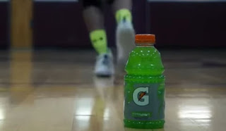
The target market for this Gatorade advertising includes individuals who are active and/or athletes, yet it could also include non-athletes as Gatorade oversees an energy drink and not just athletes can benefit from energy beverages. Additionally, the environment inside the school could immediately communicate to us that it is recommended for students, perhaps student athletes, because they might experience energy limitations on a daily basis.

A realistic set design is utilised, indicating that the film was shot in an actual location, in this case a school with a basketball court and gym, informing us that the character is a student athlete, possibly reflecting the target audience. The actor wore (costume) a hoodie, sport pants, basketball shoes, and an Adidas backpack, which are typical athletic attire for high school kids. However, the actor is seen beginning the activity in the following scene sporting the same pair of shorts and a sleeveless top. The props are a drink vending machine, a basketball, and some exercise equipment. The primary goal of this promo is to recap those props. The drink serves as the actor's primary energy source for the following basketball game and weightlifting training. At the beginning referring to the staging and composition, we see a symmetrical setting with the actor's body standing in the center to give us a notion of who he is—a student athlete—as well as the surroundings, which are the school's hallway. It is clear from the fact that the school's basketball court serves as the main stage that this event is intended for athletes and/or other active people. Since it is somewhat opaque, the overall colour of tone used throughout the entire advertising is a shade of black or grey. Black symbolizes "power," and gaining power is the goal of Gatorade. The act performed by the actor, where he casually walks towards the vending machine in the school's hallway and buys a Gatorade beverage before engaging in their training, which consists of playing basketball and lifting weights. The main ideas are very simple to us as viewers, and he then goes on to carry out his actions on the school's basketball court. The actor's lack of enthusiasm is evident in his body language and facial expressions as he enters the hallway to buy the drink and continues through opening it. However, upon intake, it is evident how heightened and empowered the actor is when the activities begin. Following a full shot of the actor moving through the school's hallway, the camera pans from left (behind the wall) to right, revealing the figure in a back view. The actor inserts coins into the vending machine, and the camera slowly zooms in to show him receiving the drink. The actor is then seen opening the drink and drinking it while on the basketball court in a medium close-up view. The next scene featured the actor playing basketball while the camera tilted downward and accelerated to tilt upward in a forward direction. There were numerous full shots and high angled shots, along with zoom in camera movements, as well as close-up and low angled shots of various parts, such as the actor's shoes, to demonstrate the speed movements while participating in the activity. The camera then tilts upward to reveal the actor playing once more after the Gatorade drink has been placed on the court's floor by the actor. The advertisement's editing effectively depicts the timeline of events with quick cuts to show how the energy from the drink impacts our activities heavily and quickly and how we can advance better after drinking, particularly when we, for example, are active people, such as athletes, who need extra energy to concentrate better. It is shown that the actor plays basketball, as they need more energy to be efficient and effective. The lighting inside the school in this advertising is quite gloomy and dark to suggest that everyone has left, suggesting that he still needs to practice basketball late and might need to regain energy after a long day. Effectively conveying that there is still life and that the scene is not completely dead when the guy first approaches the vending machines by having only their lights illuminated shows that the main notion is the drink inside the machine. However, there is a scene that demonstrates how the lights change as the energy increases, and the corridor is brighter after he exits the court. This may imply that the drink boosts our energy and improves our mood after drinking, especially for individuals who are active and need the extra energy to continue. Except for the actor's movements, such as working on the vending machine and opening the energy drink, there were hardly any sounds at first. This draws viewers' attention to the activities taken and how important a role they will play throughout the commercial. But after the drink is consumed, upbeat music plays to represent how the energy drink intensifies the feeling and energy. Additionally, the editor has included the sound of the actor dribbling the basketball, in addition to sound of the basketball shoes rubbing against the floor of the court, to further imply speed. In relation to Gatorade's beverage, the sound of the Gatorade bottle being placed on the ground is emphasized and amplified, probably to alert viewers that this is the product being sold by making it louder than the background music. Additionally, the uplifting music indicates that we are more driven to engage in activities, particularly if we are students and/or active individuals. At the end, there is a slogan that reads "Win from within," suggesting that we may achieve unrealistically high goals and embody that enthusiasm within ourselves, allowing us to push ourselves harder and perform better. Full uppercase letters in a sophisticated font with sharp edges to demonstrate the potential we can possess and to compel. This relates to the main focus of Gatorade and their energy drink as they take into account how students and/or athletes need extra energy and how convenient it would be to proceed on their activities, for example, as shown in the advertisement, practicing basketball skills. The advertisement takes place in a school and the school's basketball court to suggest that it is indeed targeted towards students and/or athletes. The advertisement is set in a school and the school's basketball court to suggest that it is indeed targeted towards students and/or athletes. This is related to the main focus of Gatorade and their energy drink as they take into account how students and/or athletes need extra energy and how convenient it would be to proceed on their activities, for example, as shown in the advertisement, practicing basketball skills.


ADVERT 2: BARBIE

The target audience for this Barbie "Endless Curls" advertisement is mostly young girls and children between the ages of 3 and 12.

The stylistic set design employed for the salon is done so that viewers will recognize and recollect it. But because a salon is formally established in the real world, it is also realistic. The salon is another location that young girls wish to visit, so they can practice the hair curling activity that can be done in salons through toys in real life for young girls. These outfits/costumes represent what young girls between the ages of 5 and 10 typically wear and could be described as "Barbie-like." The blonde girl wore a purple long-sleeved top and black and white leggings with a splattered pattern, while the brunette girl wore a blue blouse paired with blue jeans. In addition to being utilized as costumes, it may also serve as a source of inspiration for young females. Salon chairs, mirrors, and the genuine toy with a miniature curling iron and hairbrush are among the props. All of them are the purpose and concept of the advertisement, which features Barbie's initial goal for the new toy they are promoting. The often used props in the advertisement could imprint that in the minds of the viewers and express it as an engagement to persuade them to make a buy. In reference to the advertisement's staging and composition, where in the opening scene with the two girls, the rule of thirds is quietly applied to organize and balance the characters and other elements in the scene. Additionally, eye level framing is acknowledged and utilised to establish a connection between the advertisement and the target audience, young girls. If the scene has a clear balance between these and the main feature, they can capture the audience's attention. The Barbie commercial's general color scheme is pink, which is associated with femininity and recognizes that it is targeting young girls. By doing so, it is attempting to connect with these kids more. The two young girls who is starred as actors in the commercial who play with the Barbie dolls have the enthusiastic, outgoing, sassy, and sparkly looks that go along with sitting in a chair at a salon and twirling their fingers through their hair. Their vocal characteristics also exhibit excitement, and they frequently interact with the audience by asking questions like "Ready for a new look?" or "How about you?" This will cause them to capture the interest of young girls because it may heighten their interest if the actors they see on TV are amusing and pleasant. The two females also address the viewers as "girlfriends," which implies that they are bringing the targeted young ladies to participate and establish connections with them. In addition, the two stars offer several curl ideas with descriptive descriptions and subtle movements; this may be seen as an original example of the wide range of things young girls can imitate on Barbie's hair, peak their attention. Relating to the element of camera, the two Barbie dolls were briefly faded in and slightly zoomed in at the beginning. Additionally, there are a lot of reverse zooms and/or zoom outs during the transitions of the Barbie doll curling process, and the majority of the images are medium shots of the Barbie taken from an eye-angle perspective. However, there are also close-up shots when tiny objects, like the hairbrush, curling iron, or rollers are displayed. The camera would occasionally just remain motionless. The camera then goes downward with an incredibly close-up angle to follow the doll's hair being brushed, allowing the action to be recognized. A medium close-up shot recognizing Barbie's beauty appears towards the end. All of these may simply catch the interest of young girls because they would require them to pay close attention and increase their attentiveness. This commercial uses editing, such that pop-ups and gentle transitions are used in the editing. Barbie's logo appeared at the beginning in time to the "Barbie!" background music. The next scene features a girl spinning while seated on a chair. At first, her hair is straight, but as she turns, it becomes curly, giving her a different appearance—this is the major message of the product being advertised. A little while later, the next scene features a before and after hair change for the real Barbie doll as well. The various hairstyles that can be done on the Barbie doll are shown in the following 4-square collage. There are also numerous cuts of the various toys included in the set, including a miniature curling iron, a step-by-step illustration of various curls that may be achieved by cuts, a slow-motion shot of the finished hair being spinned, and a hairbrush. Another logo is then displayed, but this time a tagline pops up to subtly exaggerate. Young girls and/or the audience might find it interesting and fun to play with because of the relatively quick cuts, which could signify the good chaos and transmit all key information at once. This commercial's lighting is exceptionally bright and colourful, indicating that it is leaning toward a cheerful and energetic form of advertising so the target audience, young girls, may engage more effectively. It also affects how we perceive the advertised goods because, in bright lighting, it might be perceived as very entertaining and thrilling. This commercial's sound is very lively and features their own theme song, which helps to enhance the main message. The repeated use of lyrics that are relevant to and similar to the product being promoted, such as "endless curls," makes it easier for viewers to understand the commercial's initial goal. Greater involvement is encouraged by an energetic and upbeat theme song since young females may interpret it as being inviting. Barbie's major goal, which is to connect young girls' ambitions and engagement, is relevantly addressed by the slogan "Anything is possible," which has the potential to empower young girls. Given that they are still learning, young ladies are particularly affected by the slogan, making it possible that it will act as their muse. The pink color utilized in the font, which is a form of dull cursive script, also contributes to femininity. As the Barbie font and/or logo are relatively striking and spectacular, I think that this could appeal to young females. The setting is a salon, where the ultimate focus of the Barbie product being advertised is to perform what salons often do, which is curl hair. The salon is one of the locations young females want to go for experiences, so it will draw their attention. Young girls might also like to try out activities like curling their hair, thus this could enable them to accomplish that.